The red flags and magic numbers that investors look for in your startup’s metrics – 80 slide deck included!
Growing startups and evaluating startups share common skills
Earlier this year, I joined Andreessen Horowitz as a General Partner, where I focus on a broad spectrum of consumer startups: marketplaces, entertainment/media, and social platforms. This was a big moment for me, and the result of a long relationship that began a decade ago, when Horowitz Andreessen Angel Fund funded a (now defunct) startup I had co-founded. One of the reasons I’ve been excited about being a professional investor is the ability to apply my skills as an operator. The same skills needed to grow new products can be used both to evaluate new startups to invest in, and once we’ve invested; to help them grow.
The reason for this is that the steps for starting and scaling a new startup share many of the same skills as investing in a new startup: 1) First, we seek to understand the existing state of customer growth – including growth loops, the quality of acquisition, engagement, churn, and monetization. 2) Then, to identify potential upside based learnings from within the company as well as across benchmarks from across industry. 3) And finally, to prioritize and make decisions that impact the future. Of course, as an investor you can’t run A/B tests or analyze results directly, but you can form hypotheses, ideate, and apply the same type of thinking.
As part of my interview process at a16z, I eventually put together an 80 slide deck on how to use growth ideas to evaluate startups. In the spirit that this perspective can help others in the ecosystem, and to share my thinking, I’m excited to publish the deck below.
Disclaimer: This was just one presentation in a 10 year relationship
But before I fully share, I have a disclaimer. This is one presentation I made within a series of dozens of meetings and interactions I had with the Andreessen Horowitz team. It was just one ingredient. I’ve been asked by friends and folks on the best path into venture capital. From my experience, it’s a long, windy experience – others have written about their processes as well.
My journey took a while too:
- 10 years in the Bay Area (and blogging, building my network, etc)
- Dozens of angel investments and advisory roles in SaaS, marketplaces, etc
- Once kicked off, 6 months of interviews (dinners, sitting in pitches, analyzing startups)
- 100+ hours of interviewing and prep
This deck was just one step, but one that I’m proud of, and want to show y’all.
The Deck

Above: I presented this deck as part of my interview to join Andreessen Horowitz to help demonstrate my expertise and “superpower” and how it might be used in an investing context.
As a result, it’s split into three sections:
- About me and my superpower
- How to apply user growth ideas in an investing context
- My continuing leadership in the field
Let’s get started!
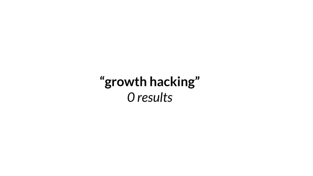
Above: When I first arrived in the Bay area, if you had searched for “growth hacking” – you would have gotten zero results. It wasn’t a thing. Some early companies like Linkedin and Facebook had started the notion of “growth teams” but this wasn’t a widely understood set of ideas in the industry.
While there were people thinking about user acquisition and ad tech, and some early consumer teams (like Eric Ries’s IMVU) thinking about cohort curves to mention retention, it hadn’t been centralized into a team that could execute against it.
I started my blog originally to write down everything I was learning. My previous background up to that point was in user acquisition and ad tech, and I was making the pivot to consumer products. There was a lot to learn.
As I learned from the best in the industry – in particular from the PayPal mafia who had employed a metrics-driven viral approach to build some of their most iconic companies – I started to write about what we’d now call growth.
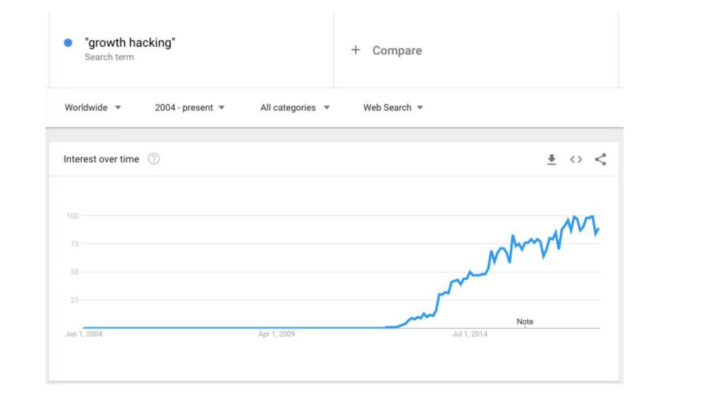
If you look at Google Trends, you’ll see that “growth hacking” all of a sudden became a term people in the industry were interested, and were searching for, in 2012.
There’s a reason for that. I’d like to take some credit :)
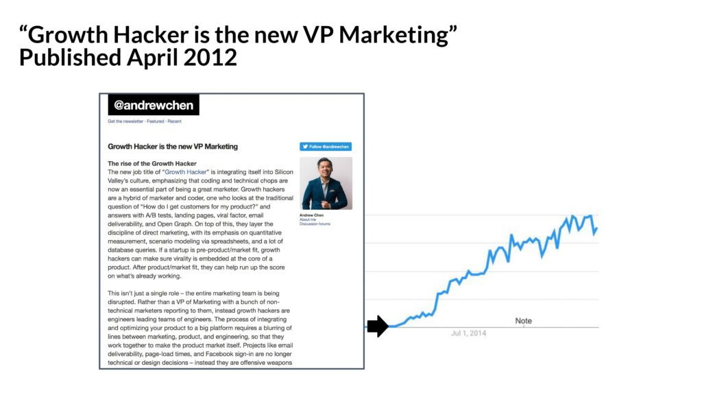
I was lucky with the right timing, the right content, and with inspiration from my friend Sean Ellis to be able to popularize the terminology and ideas around “growth hacking” in an essay I wrote in 2012.
And these days, it’s spread and become its own ecosystem.
Teams focusing on user growth have spun up across some of the best companies in the ecosystem!

(As of early 2018, when I had presented this, these were some of the companies that had growth titles or formal growth teams)
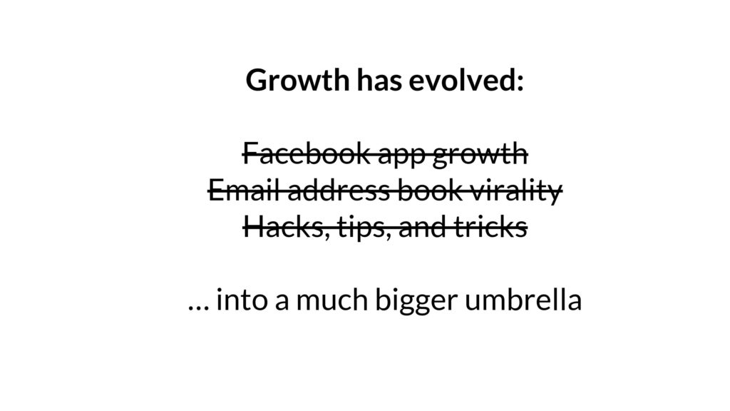
Of course “growth hacking” has changed a lot – it’s no longer about hacks as much as a much bigger umbrella as it’s become a more professionalized, formal function within a team.
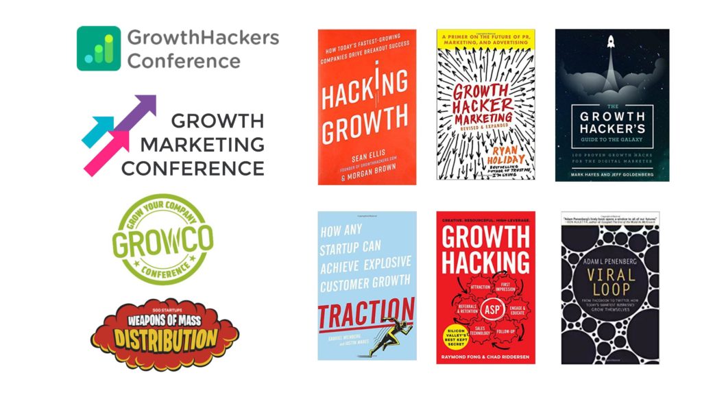
One evolution is the number of books and conferences now dedicated to growth.

The other evolution in the ecosystem is that people are thinking about different things – about how to build growth teams, not just hacks. Thinking about new user experience, engagement metrics, and other important concepts.
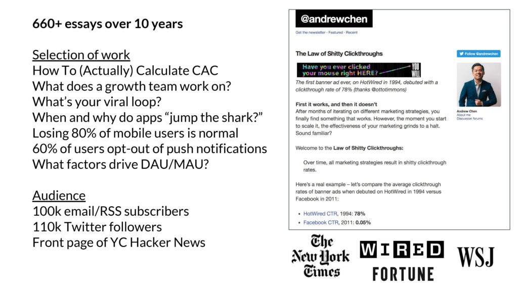
I continue to contribute to this ecosystem by writing, being involved in social media, and press.
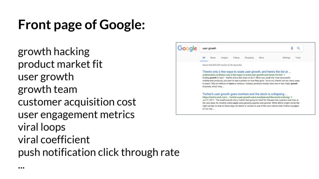
As part of that, as folks search for important concepts like “product market fit” and “user growth” – my essays are often on the front page. These are evergreen concepts and were relevant 5 years ago, relevant today, and will be important in the next phase of tech as well.

Beyond writing, I’ve also extended my efforts to bring together the high-end professional network of people working on startup growth. This hits a different part of my network as it’s a deeper relationship, and Bay Area focused, as opposed to my essays and social media which are global.
To accomplish this, I’ve been working with Brian Balfour (ex-VP growth from Hubspot) to start up Reforge which has educated 1000s of employees from top tech companies.
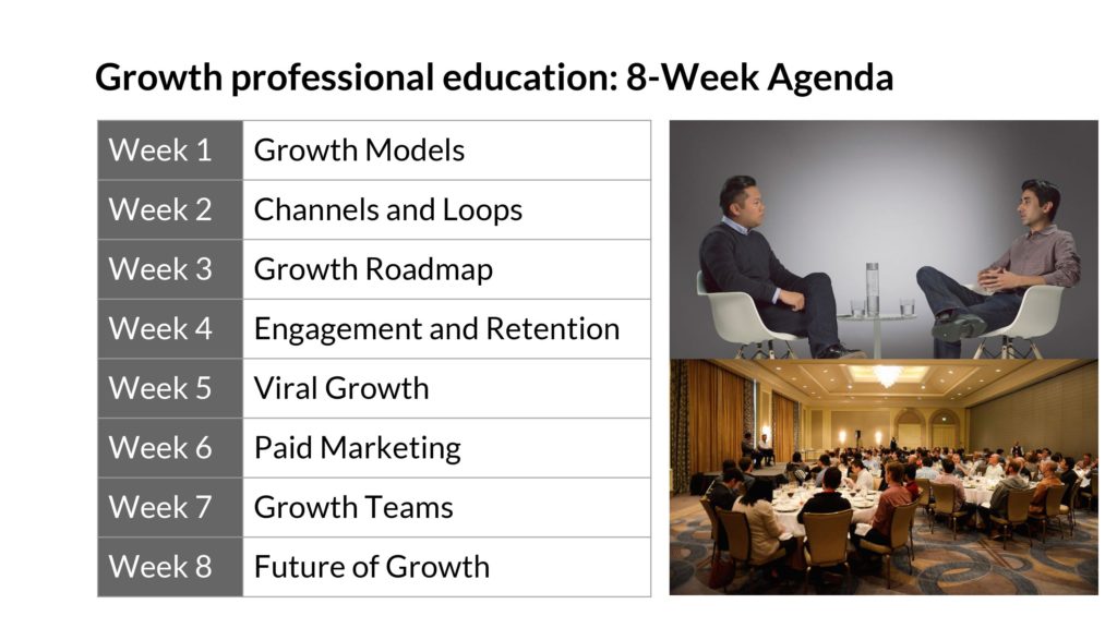
The flagship program on growth is 8 weeks and pulls together some of the foundational concepts.


The speakers include executives who run growth or related functions from across the industry. (Thank you to all the wonderful people who are involved with Reforge! Y’all are awesome and I’m happy to count you as my friends)
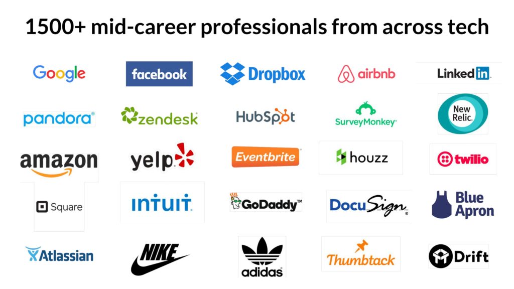
In the past few years, over 1500+ folks have attended the program from almost every company in the Bay Area and many F500 enterprises as well. This includes CEOs/founders, VPs, PMs, marketing folks, data science, engineers, and so on.
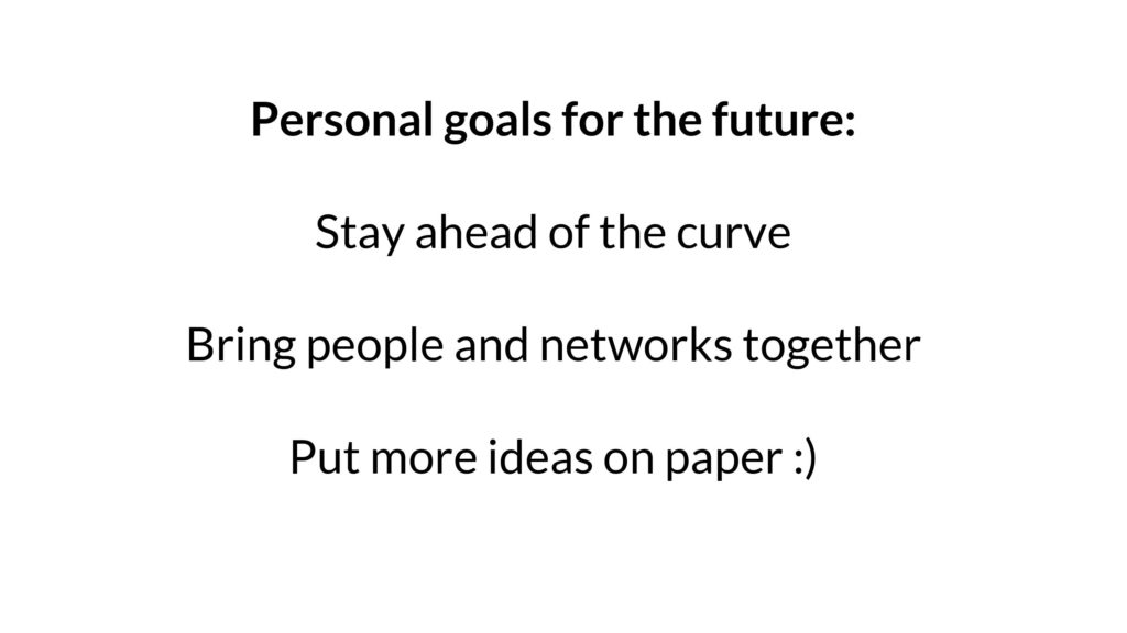
In the coming years, I want to stay as active as possible – to stay ahead of the curve by spending time with the smartest people from across industry, to bring communities together, and to continue to publish ideas. Establishing myself in the industry has taken a decade in the Bay Area and I intend to spend the next few decades at the same pace!
Next, let’s change gears. After all this talk about startup growth, how might you use this to evaluate new products in an investment context?
In this next section, I’ll present some of the central ideas in user growth and how you might use that to evaluate the quality of a startup’s growth as opposed to getting stuck on vanity metrics.
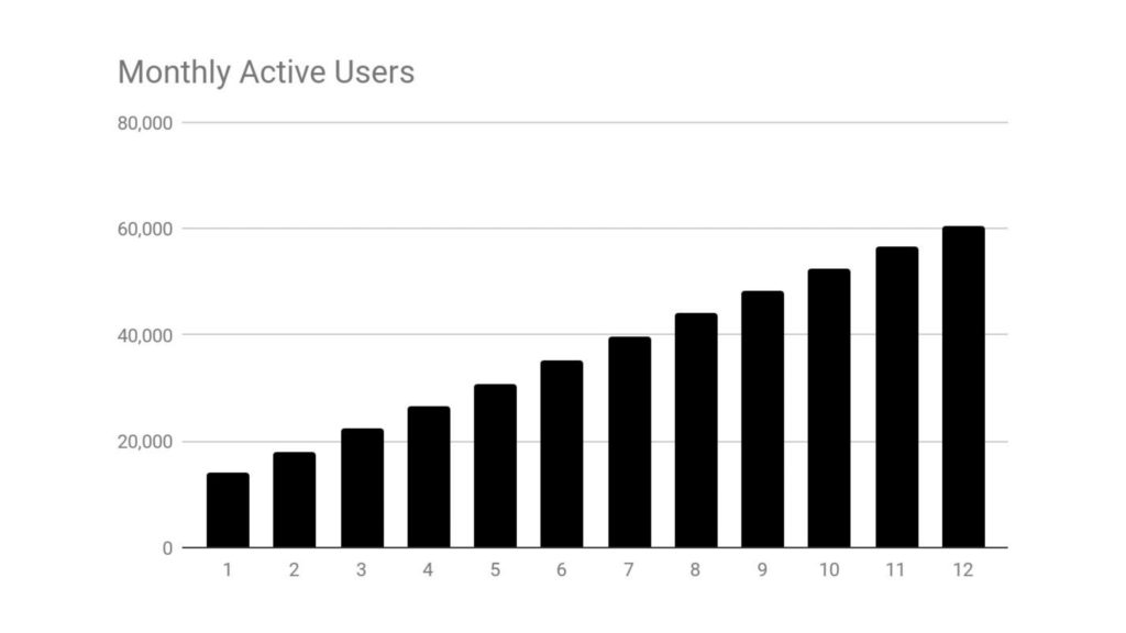
Above: To start, oftentimes you’ll find a new startup that presents their growth curve, which might look something like this – up and to the right! This is great. Time to invest, right?
The problem is, you don’t know where it’s going to go.

In the long run, over the course of an investment, you’ll find that this curve might go in a direction you may not want it to go – perhaps it’ll plateau. Perhaps it’ll even collapse. Or you may find that it’s going to continue going up, and even hockey-sticking.
How do you predict the future? Is it working and will it sustain? Will it even accelerate?
There’s a couple common frameworks to try to understand this, and one is the Growth Accounting Framework.
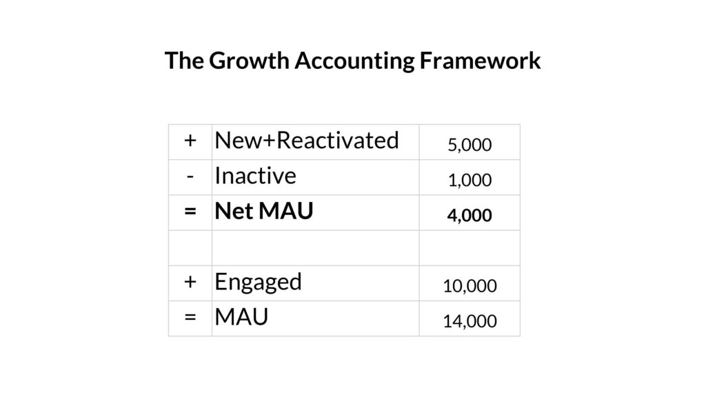
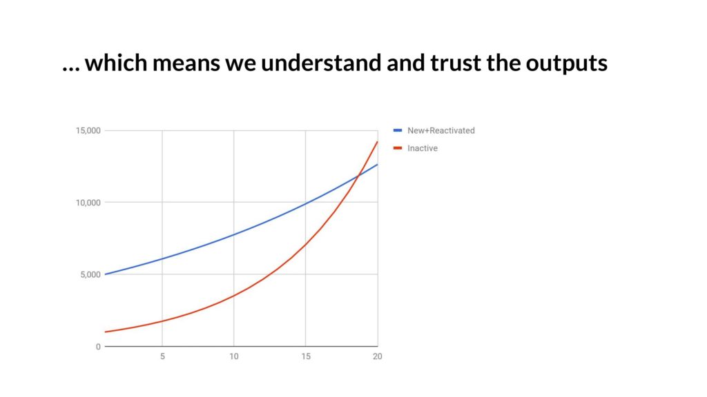
The Growth Accounting Framework looks something like this – within each time period (say a week, or a month) – you’ll add some users, reactivate some folks who had previously churned, and some go inactive. You add this up and it’s the “Net MAU” for a product – the difference between each time period.
If your positive terms (New+Reactivated) are smaller than your negative terms (the number who become Inactive) then you stop growing, and the whole thing goes negative.
Let’s look at each term in isolation.
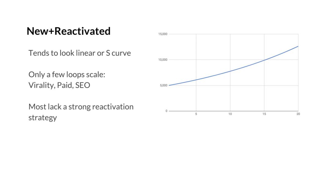
The New+Reactivated term tends to look linear or be an S-curve. The reason is that it’s really really hard to scale acquisition – only a few, like viral loops, paid marketing, and SEO can bring you to millions or tens of millions of users. And as the acquisition channel gets bigger, it tends to get less effective. Ads become more expensive to buy, viral loops end up saturating your target market, etc. This term dominates.
Reactivation tends to be hard to control. If someone quits your product, emailing them a bunch of times probably won’t help. (But if you have a network, something like photo-tagging or @mentions might!). But most products don’t have a network, and as a result, the acquisition term tends to be much bigger than the reactivation one.
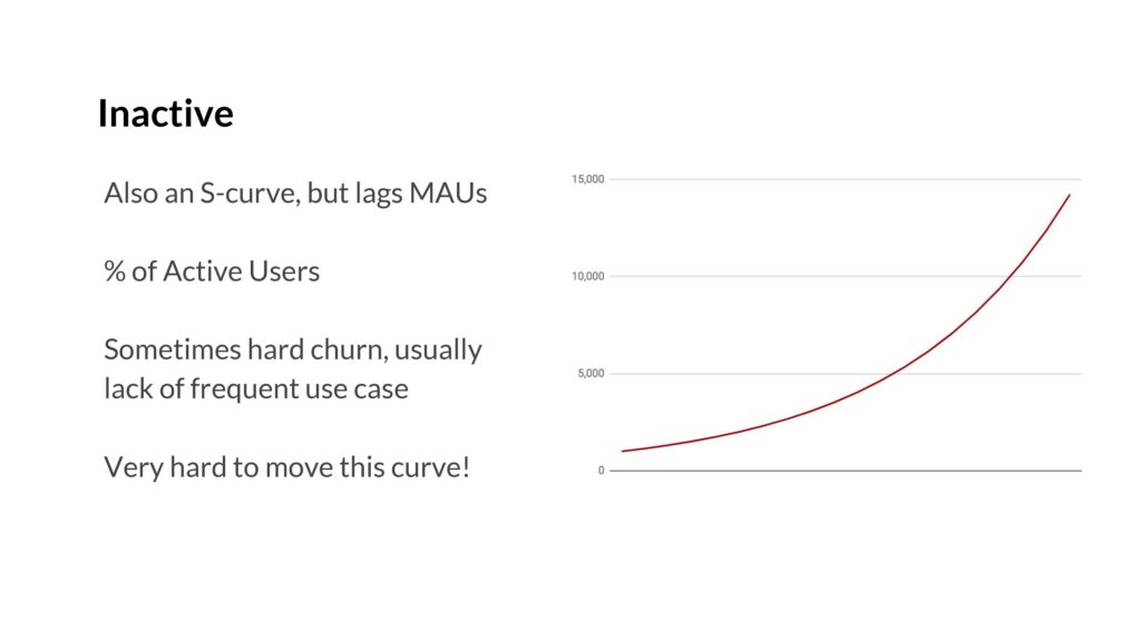
Above: The Inactive curve is also an S-curve, but it lags acquisition. It’s simple to understand why, which is that until you have a base of active users, you can’t really churn. You can’t churn anyone when you have zero users. So it goes up over time. So usually your acquisition curve pushes you up, and then churn starts.
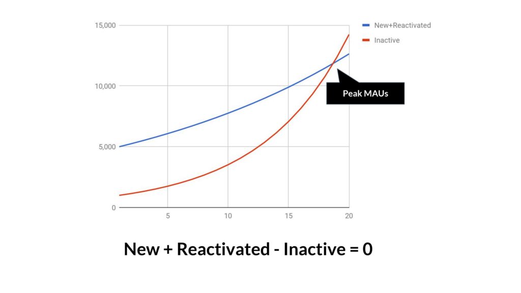
At the moment that your New+Reactivated is equal to your Inactive users, each time period, then you hit peak MAUs. This is the thing to watch for, because then it’s all flat or down from there.
I use MAUs in this example but you could also use active subscribers, or users who have bought something in the past 30 days, or some other definition. The underlying physics are the same.
If you’re following all of this, it’s already a pretty profound insight. We’ve moved from looking at a single curve that might have been growing and decomposed it into its underlying terms, and shown how a curve that’s been going up and to the right for a while might go flat the next month. And why. That’s important.
But there’s a problem.
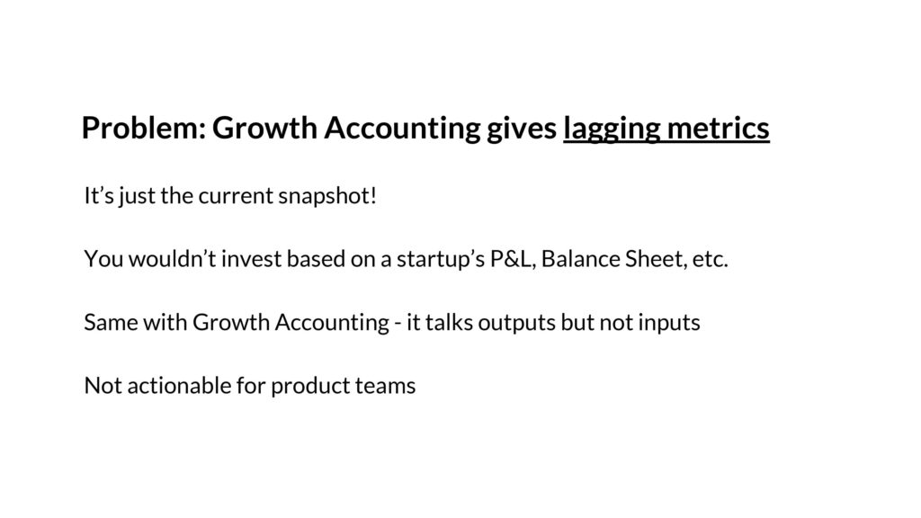
The problem is that the Growth Accounting Framework provides for lagging metrics. It’s hard to predict the future. It’s the equivalent at looking at company’s current year P&L and its constituent parts – it’s useful, but not enough. It’s hard to be predictive. It’s also hard to be actionable for product teams.
That’s why for the growth and product teams I’ve advised over the years, this isn’t something you can look at every day or every week. It’s not helpful.
Instead, you need leading indicators and a more predictive conceptual model.

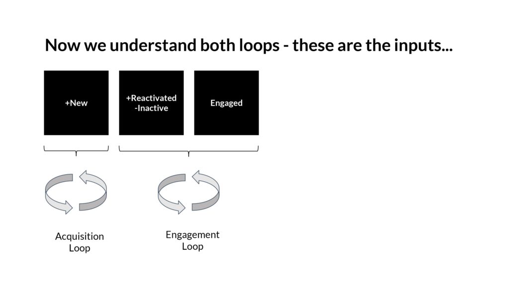
Above: To do this, I advocate that we look at two key loops:
- Acquisition loops, which power the positive term for New
- Engagement loops, which power the negative terms on Reactivation and Inactive
Understanding these underlying loops is the key to the whole problem of predicting where a graph is going to go.
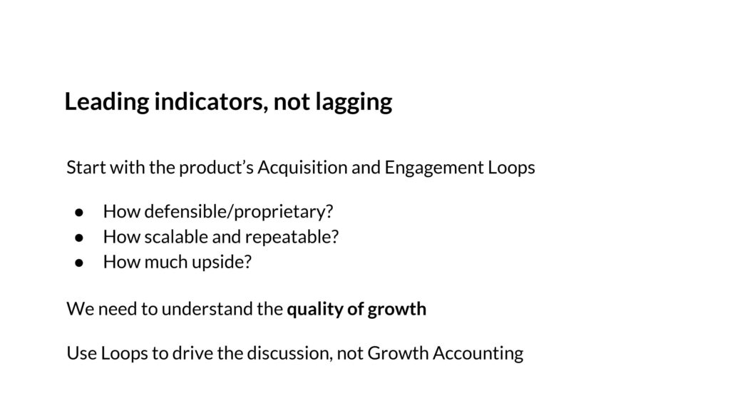
In understanding these loops, I don’t mean to simply chart them out in a spreadsheet. I mean to think about the quality of the loops – how defensible and proprietary are they? How scalable and repeatable? Is there upside in optimizing them or adding to them further?
In other words, we want to understand the quality of the user growth. If we understand that, we can forecast into the future as opposed to looking backwards.

To start, let’s look at the Acquisition Loop.
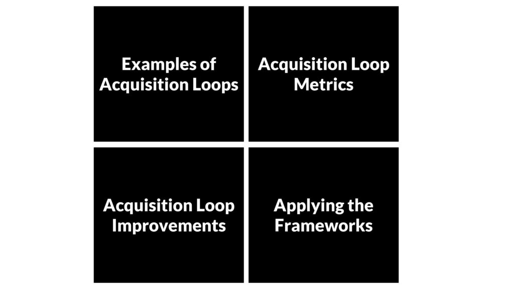
Above: There’s 4 sections of content we’ll go through- first, to understand the examples, then what metrics to examine. Then to look at how to best improve the loops. And finally, we’ll try to apply the framework.

Let’s start with examples.
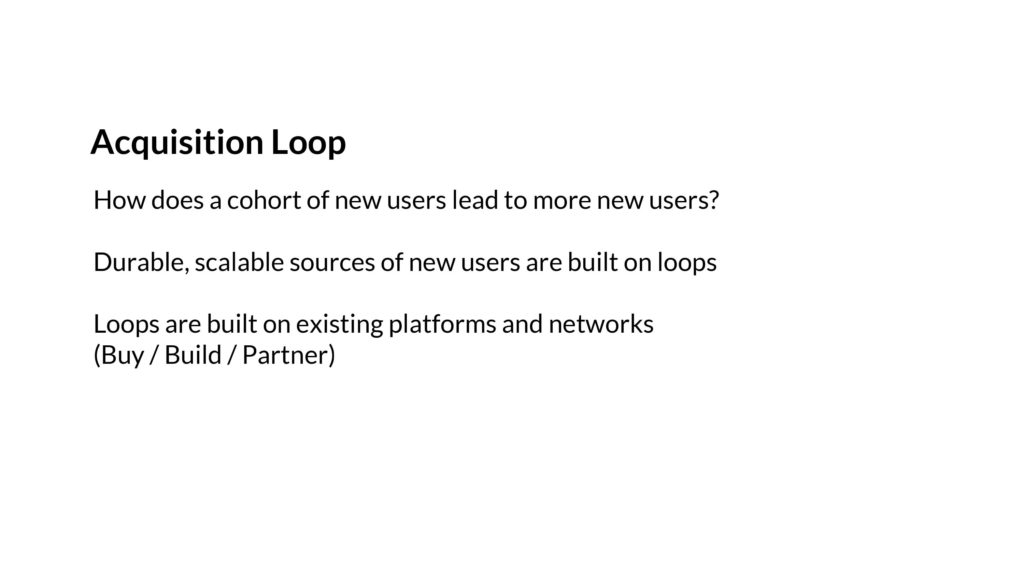
Above: The key thing to ask for the Acquisition Loop is to understand how a cohort of new users leads to another set of new users. If you can get that going, then by a conceptual proof by induction, you’ll be able to show how it scales.
Importantly, these loops are flows within the product that are created on top of pre-existing, large platforms. Sometimes the loops are built because they are bought – via Ads. Sometimes they are built via API integrations, to allow for easier/faster sharing. And sometimes it’s via a partnership.
Let me talk through some examples.

A product like Yelp or Houzz fundamentally is a UGC SEO driven loop. New users find content through Google, a small % of them generate more content, which then gets indexed by Google, and then the loop repeats. Reddit is also like this. So is Glassdoor. And so on.
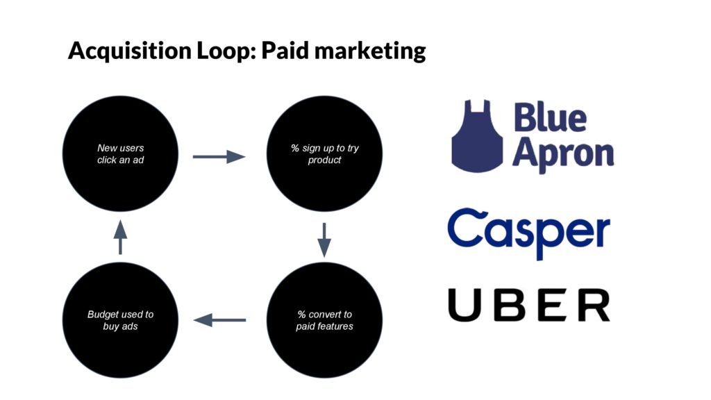
Paid marketing is also an obvious loop. Spend money, sell products, take the money and buy more ads. Keep going.

Above: Viral loops are important because they are extremely scalable, free, and don’t require a formal partnership. This is based on users directly or indirectly sharing a product with their friends/colleagues, and having that loop repeat itself.
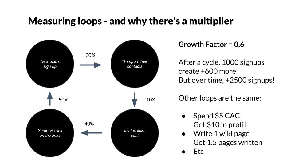
The important point here is that loops aren’t just conceptual, but you can actually measure their efficiency as well. If you can get 1000 users to invite and sign up +600 of their friends, then you have a ratio of 0.6. But that’s just in the first cycle of the loop. But then those 600 new users generate 0.6*600=360 new users, who then generate 216, and so on, until the entire cohort is +1500 signups total from a base of 1000. Wow! That’s meaningful because then for every user you get through other means, you’re amplifying their effect.
This can be particularly important when you have a large paid marketing budget, because it can drive down your cost of acquisition by blending in a scalable form of organic. It can be a huge advantage.
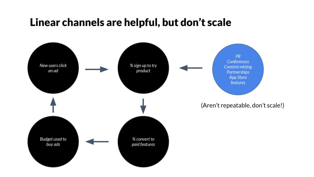
Above: What about PR, conferences, in-house content marketing, etc.? Aren’t they important? Yes, they can be- but they don’t scale. For example, conferences happen irregularly, have poor ROI/attribution tracking, and every dollar made from a conference can’t quickly be reinvested. Contrast that to paid marketing, which can be highly accountable, become very optimized, and can scale to $1B+ spend/year.
So when it comes to PR, conferences, partnerships, etc. – they’re useful, but they are more like one-off opportunities, and certainly not where the bulk of your customer acquisition takes place. Instead, you use them to drive traffic into your loop, which then gets amplified.
As a result of this model of linear channels versus loops, when you are meeting a company for the first time, you have a framework to understand if their growth will scale over time or not. If it’s a one-time launch, like they just got announced as part of the latest YC batch, well that’s not a loop.
If they have been quiet on PR, conferences, etc., but users are telling each other as part of the native functionality of the product – okay then you have my attention!
Once you understand the loop, you have you understand if there’s upside. Is it possible to improve the loop? Maybe it sucks now, but maybe it can be fixed? Or even better, maybe there’s a product growing like gangbusters but you could accelerate even further.
To understand this, you have to move out of spreadsheet world and get into product experiences.
The first move is to decompose the simplified loops we were looking and actually get into the details.

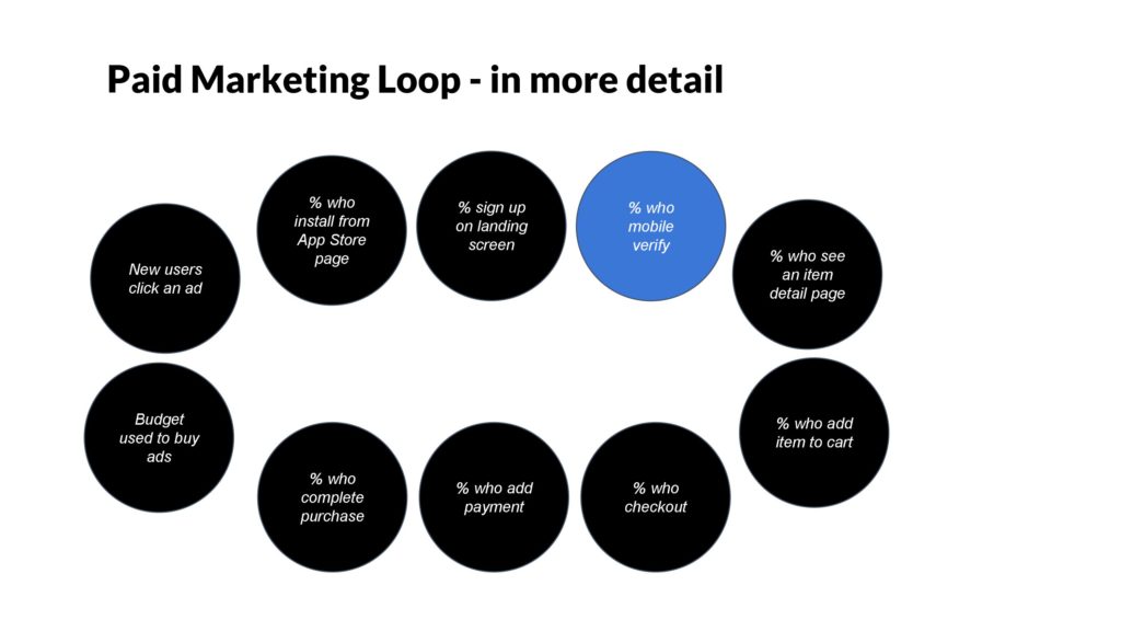
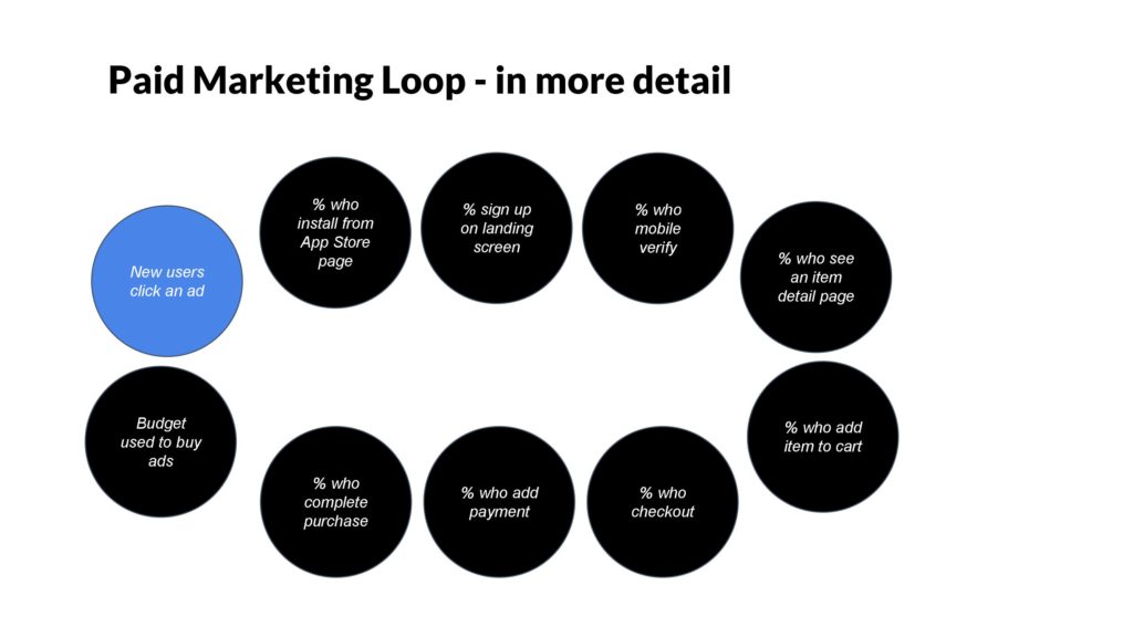
Above: Instead of just 4 steps, as shown before, now we go even more tactical. Of course new users will have to land on the app store page, then sign up. They have to mobile verify. They have to go to a certain screen on the product, then add something to their cart – hypothetically. And so on. Each step is friction. Each step drives down performance.
We ought to be able to look at every single one of these steps and improve them further.
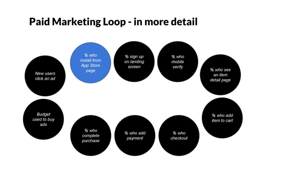
Let’s dive into one example, which is the app store screen.
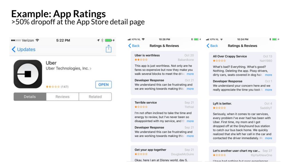
On the app store screen – and this is a real example – there’s reviews. There’s a star rating. The bounce rate on the app store screen can often be very high, sometimes 50-80%.
In 2016, the star rating on Uber’s rider app was low. 1.7 stars, in fact. Ouch.
There were a lot of reasons for this, but on fundamental issue was that only unhappy riders were rating the app. It’s a common best practice to ask a broad spectrum of users to rate your app, and the Uber app wasn’t doing that. This was controversial because there was some desire to “cherry pick” only happy riders, for fear that the rating might stay low.
Nevertheless, the best practice was implemented and shipped.
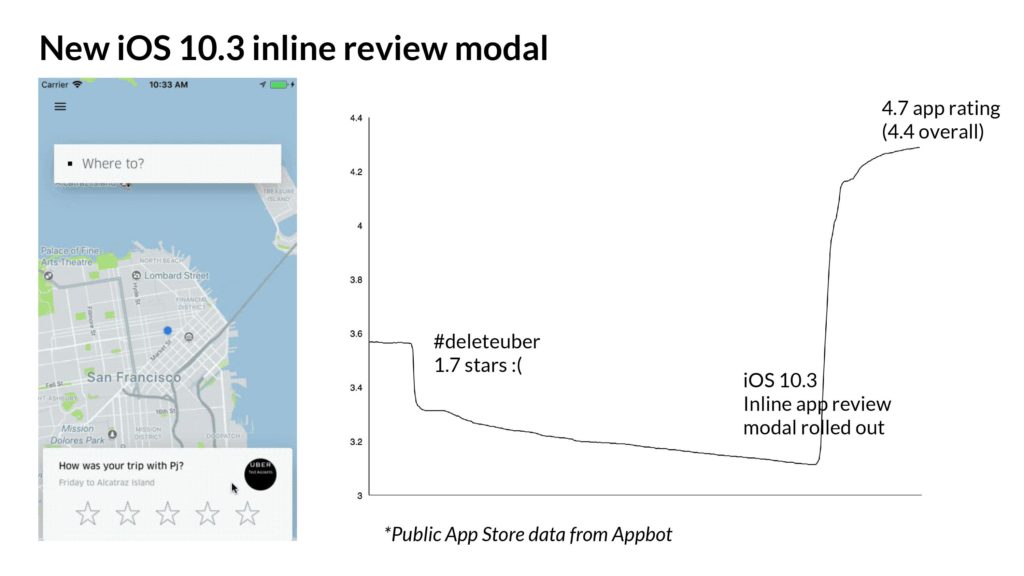
Here’s what it looked like- after a trip, regardless of what the rider rated their trip experience, it would ask the rider to rate the app. And very quickly, the 10s of millions of users who had happy, successful trips weighed in. Quickly things moved from 1.7 stars to over 4.7 stars, where it still sits today.
A change like this is worth on the order of millions of incremental downloads for Uber. It’s a small change, but had a lot of upside. (Congrats to the Rider Growth team for shipping this! Miss you guys!)
Let’s look at another example- having all of your users verify their phone numbers. You’ve done this a million times.

It turns out, having people verify their numbers is a high friction step and oftentimes, there’s a 10-40% dropoff rate just on this screen. It might be because your phone number was entered incorrectly. Maybe you’re international – an important use case for travel-oriented apps like Uber. There’s a whole series of updates you can make to improve this step – from partnering with carriers, allowing a voice call to verify, and so on.
One more example on creating upside – which is on the back part of the paid marketing loop, when a new user clicks on an ad and lands into the product. The landing page they see is important.
And it’s so important, years later, they all look the same.
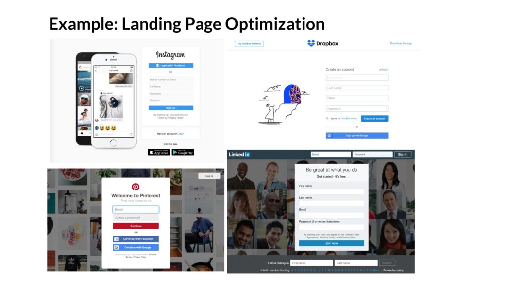
There’s a reason why so many landing pages are just signup forms. Not a ton of information about the product, not a lot of frills- just an ask to sign up. The reason for this is that after years of testing, this is what performs best when you are invited by a friend.
So if I see a startup that doesn’t directly ask for the signup, I assume there’s upside that can be gained.

These landing pages – often the first experience of a new user – are super important because the bounce rates are often over 80%. Wow. That’s almost everyone! So there’s a playbook of common changes you can make – from removing friction, pre-filling fields, adding video, optimizing for everything being above the fold, etc.
OK, we’re done with the examples. Now once you understand the upside, let’s say you want to dig into the data. What KPIs do you look at, and what are you looking for?
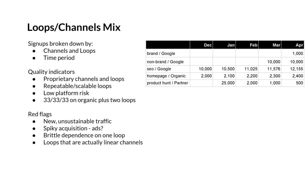
Above: The first thing to ask for is the product’s Acquisition Mix. This is a look at signups broken down by channels/loops and by time period (ideally weeks). I’m looking for signals that the dominant channel(s) are proprietary and repeatable. Ideally they are loops. I want low platform risk, where there isn’t a dependency on a larger company that might change their mind. (I.e., Instagram, Google SEO, etc.). A good mix might be 33/33/33 where you have a third organic, plus two loops, like viral and SEO.
The red flags I look for are around new channels appearing, but which aren’t sustainable. Especially ad spend that comes and goes, indicating maybe everything’s been juiced for before the fundraise. I don’t love to see spikes for that reason.
But a signup isn’t always a signup – thus it’s important to understand the quality of a signup.
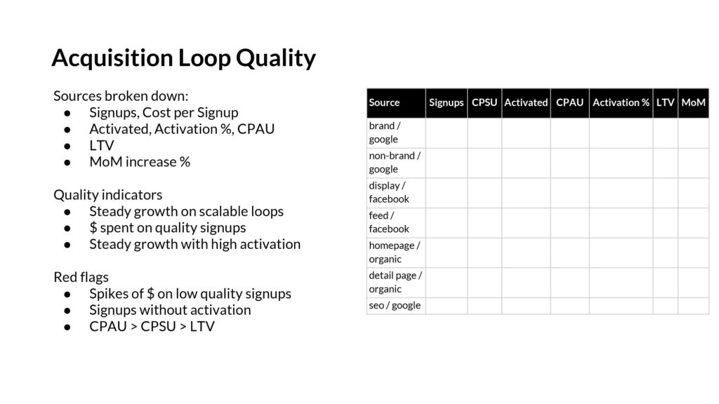
A startup shouldn’t care much about signups, they should care about how well they translate into paying customers, or active users, or whatever an “activated user” looks like. It turns out that one of the biggest determinants of “quality” of new users is the source of the user. As a result, you want to understand both how signups are being generated by various channels, via the Acquisition Mix report above, but also a sense of the quality by understanding the activation rate by channel.
The red flags here are a bunch of new users from a new channel that’s actually low quality. Or a doubling down on a new low-quality channel just to pump up the signup numbers. After all, a spike of new users count into whatever month’s MAU metric that they joined under, and it’s an easy way to juice their short-term MAU. Watch for that.
The other aspect to analyze is the concentration of new users from different sources. Perhaps a particular channel/loop dominates but seems brittle or is expensive. If all the users have come from beta users list or Product Hunt, that won’t scale over time.
On the other hand, if marketing spend and product efforts are going towards high-quality channels, that’s fantastic.

Above: As noted before, loops are usually build on top of another platform. Sometimes that’s Google SEO, email systems, Instagram, or more.
If the startup’s new product adds value to the underlying platform, and isn’t too horizontal, it might be stable. There might be a strategy to become a destination product in itself. That’d be great. But that’s often not the case.
The red flags here are focused on the integrations between the growing product and its platform- if it’s built on iOS and one of the core integrations is push notifications (like the recent live quiz apps), then look at the clickthrough rate trend for the notifications. If it’s decreasing over time, then you know it’s not working. Or on a per user basis, perhaps the average user is tapping through on the first push but isn’t engaging much with the fifth. Or perhaps the underlying platform is shrinking. If you built a product that depended on AOL Instant Messenger to thrive, that’s not a smart bet.
It’s important to understand the underlying platform of any acquisition loop because things can collapse quickly.
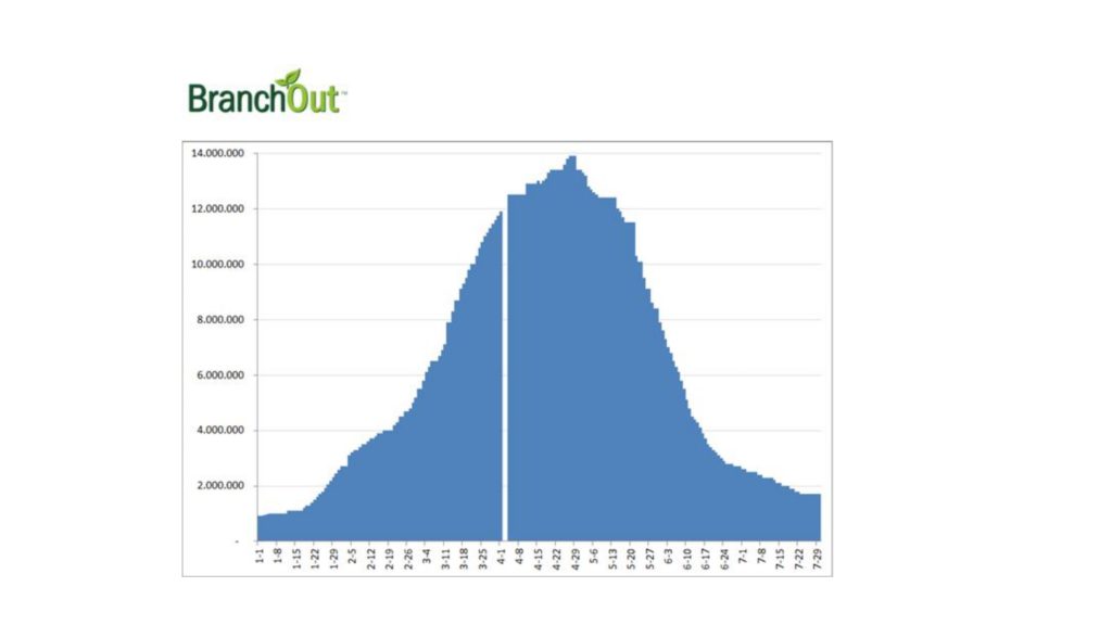
One cautionary tale is what happened with Branchout, which was trying to build a Linkedin on top of Facebook Platform. You can see how fast it grew – to 14 million Daily Active Users, and how it was 1/10 the size just 4 months later. You don’t want to invest at its peak.
Once you understand the acquisition loop concept, can forecast the upside, and have metrics to look at to evaluate quality- then it’s time to go back to our original challenge: The up-and-to-the-right graph.

OK so does this go up, or not?
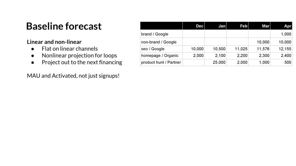
The key here is to ignore the graph, and instead use all the tools we discussed to create a baseline forecast on the engagement and user growth. Do the signups stay linear? Grow as a percentage over time? Or go flat?
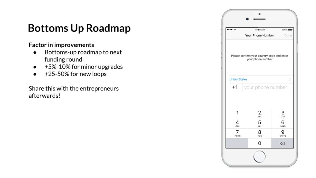
Above: Using our understanding of the potential product improvements, we ought to be able to create a bottoms up roadmap of all the improvements. We can use our expertise to understand when changes might be a +5% and when they might be a +20%. Combine all of it together, and you get a picture of the upside.
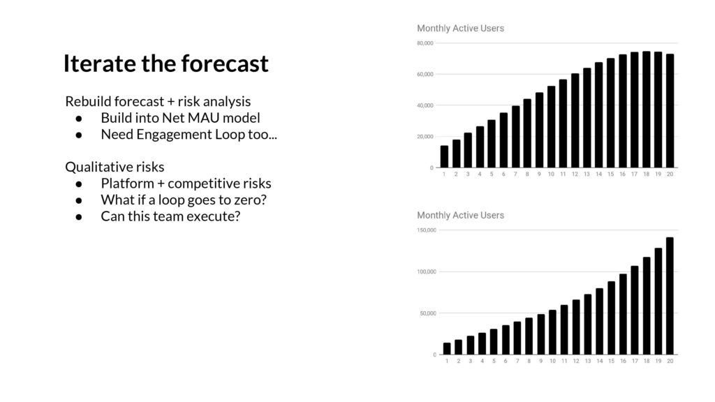
Once you have all of this together, then you ought to be able to create a series of scenarios on where your growth curves are going to go. Perhaps you can assume the product and marketing teams execute aggressively, and capture all the upside you saw. Or perhaps you can assume there’s no engineering help, and it’s just a matter of adding a few new advertising channels. All of these scenarios can be combined to create a new curve. This is your forecast. It’s a prediction of the future.
If you did all of this, you’d still have a major problem. Your prediction would suck, because you only looked at one half of the problem. The other side is Engagement, and all the loops there.
There’s an Engagement Loop, similar to what we looked at with the Acquisition Loop. Let’s take a look there.
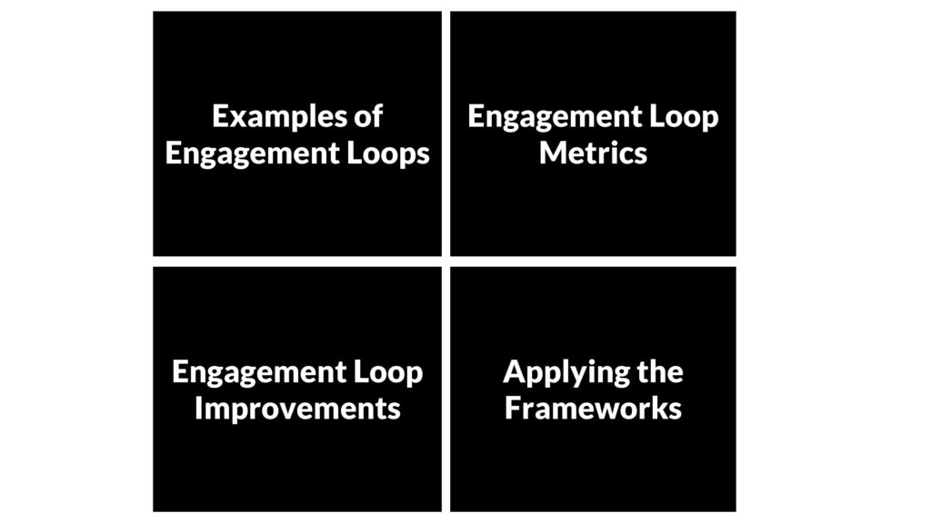
Above: We’ll go through the same format. First examples, then how to improve, then how to measure, and then let’s bring it together and apply it.
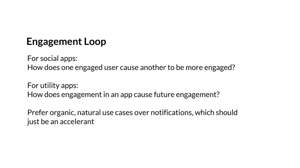
Above: The key question with engagement is similar to the one we asked on acquisition. If you have a network-based product, like Dropbox or Slack, then you need active users to engage each other. If it’s purely a utility, then you want engagement in one time period to help set up engagement in a future time period.
Let’s run through some examples.

In an engagement loop that’s based on social feedback, you get a game of ping pong. One user messages/follows/mentions another, and they draw them back. And then that user might do the same, and draw in a different user. And this repeats. This is why achieving network density and easy content creation is so important- you need ways to bring people back into the network.

On the other hand, there are engagement loops that are more like planting seeds. If you sign up for Zillow and put in your home address, and favorite a couple new real estate listings, then Zillow will start re-engaging you with personalized emails. Sometimes it’ll be when your house goes up in value, other times it’ll be when new listings show up in your neighborhoods. Credit Karma is the same, where a single setup session leads to important notifications about credit score changes over time.
These are just two engagement loops, and there are many more.
Another fun one is rideshare, where seeing physical on-the-street reminders of the product might prompt you to use it too. Mapping works in a similar way, often starting with a real-life trigger of “I’m lost!”
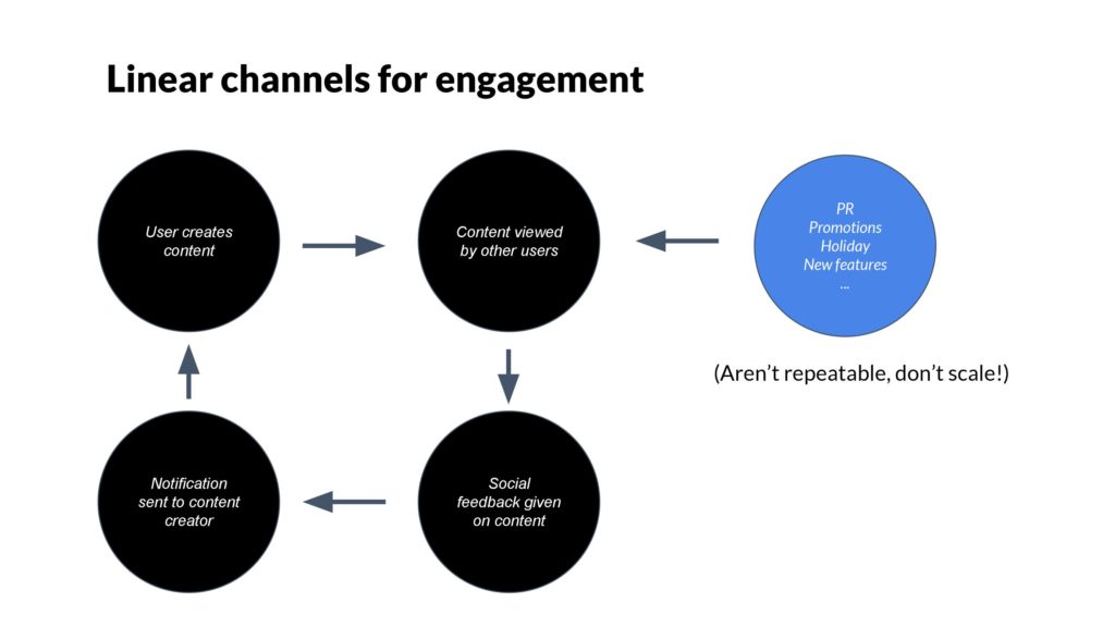
Just like the acquisition loop, there are linear channels to re-engage users. These are useful, of course, but again, they don’t scale. It’s better when users re-engage each other or when users re-engage themselves.
This is part of why marketing-driven one-off email campaigns are often ineffective. They don’t scale, aren’t interesting to users, and with enough volume, can cause folks to churn. Not good.
It’s much better to see a natural engagement loop that leverages push notifications and email in a way that’s user-initiated.
In the same way we analyzed acquisition loops to understand upside, we can do so for engagement loops.
The first step is to break down the loop into much smaller, more granular steps.
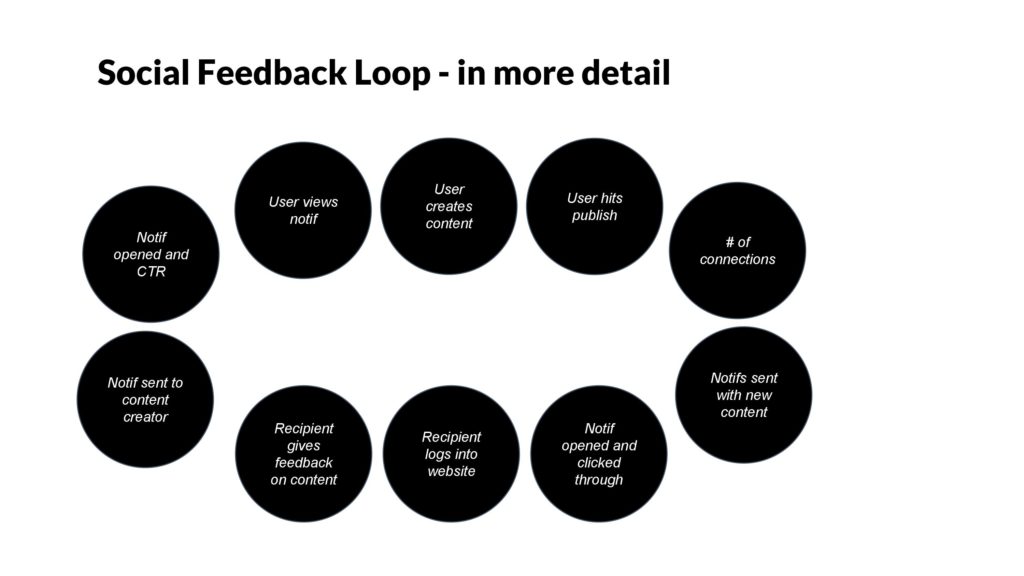
Above: Here, we’ve taken a Social Feedback loop that starts with a user creating content and publishing, to their friends viewing, adding comments, and then the notification back to the original user.
Now let’s zoom in on a particular step.
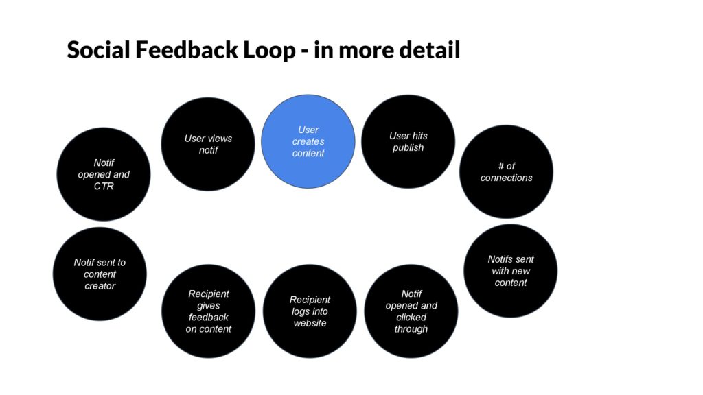
Above: The social feedback loop fundamentally is built on the content creation step. If it’s not easy, then it won’t work. So it has to be an activity that a lot of users want to do. That’s why taking a photo, typing in a text, or hitting a heart are all so effective. They’re dead simple actions.
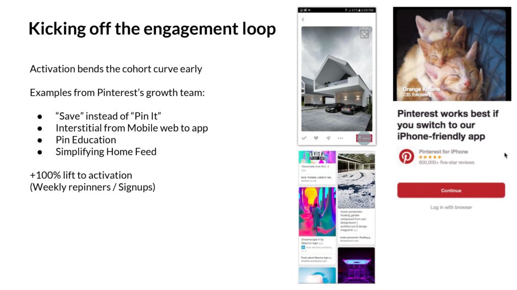
Above: Pinterest has many examples where they’ve optimized content creation – or more specifically, more pinning/repinning per new signed up user. One method is to use the term “Save” as opposed to the more wonky term “Pin it.” Another is to up-sell the mobile app where it’s easy to interact. Education during onboarding helps too. All of these changes doubled the activation rate for new users, causing them to repin more, kicking off engagement loops for themselves and other users.
Once you create content, then you need to circulate it within your network.
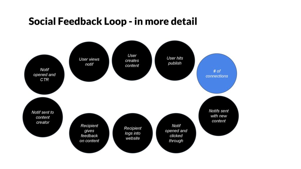
One key aspect of every network is the density of connections. It’s important to build the number of connections up, but they have to be relevant. And there’s diminishing returns too.
A decade+ into the social platform paradigm, there’s now a playbook for how to do this. Let’s cover some of these ideas.
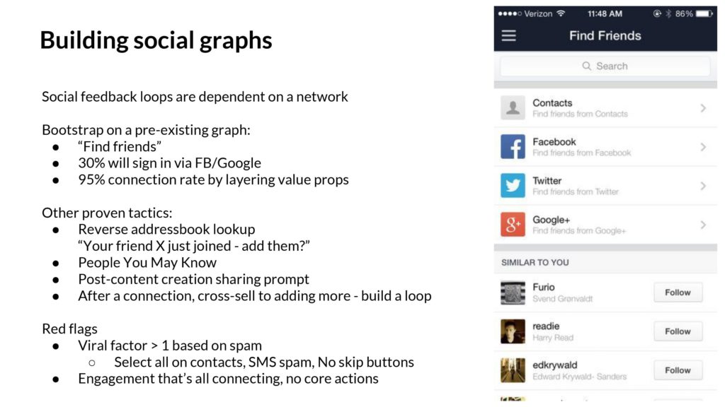
Above: An important way to build a social graph is to bootstrap on an existing network. For consumer products, that might be your phone’s addressbook or Facebook. Within the enterprise, it might be your colleagues’ emails in ActiveDirectory or GSuite or your work email. There’s tactics like asking people to “Find Friends” and to build “People You May Know” features to increase density.
The red flags here are folks who claim to have explosive viral growth just based on inviting. It won’t last, and they’ll be low quality signups. Similarly, if the core activity is all inviting and friending and there’s no main activity, that’s not good either. Better to let those ones go.

As a final examination of looking for upside in user engagement, it’s important think about an otherwise innocuous step- your users clicking on a notification, trying to get back into your product, but perhaps they’ve logged out.
How bad can it be to get logged out?
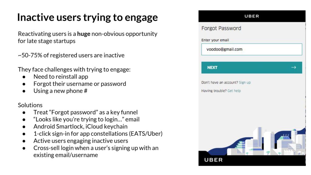
Turns out, being logged out and failing your password attempts can become a huge drag for established products with large audiences. It’s common for 50-75% of signed up users to actually be inactive – that is, the majority of your users will have tried the product but never get hooked.
The problem is when those inactive users come back, perhaps because of a notification or some other reason, and try to log back in. They often are locked, can’t remember their password, and become permanently inactive. Not great. The solution is manifold – first to treat this flow seriously, with KPIs and optimizations. There’s tactical things, like integrating into iCloud keychain, logging in with other apps if you have a multi-app strategy, and so on.
A company like Uber might literally see tens of millions of failed sign in attempts. Amazing. And perhaps a good percentage of those riders are trying to log back in, standing at an airport wanting to take a trip, and eventually, in frustration, they walk across the street and grab a cab. It’s worth fixing.
Now that we have the conceptual idea of an engagement loop set, and understand potential upsides, let’s dig into the metrics. What should we look for?
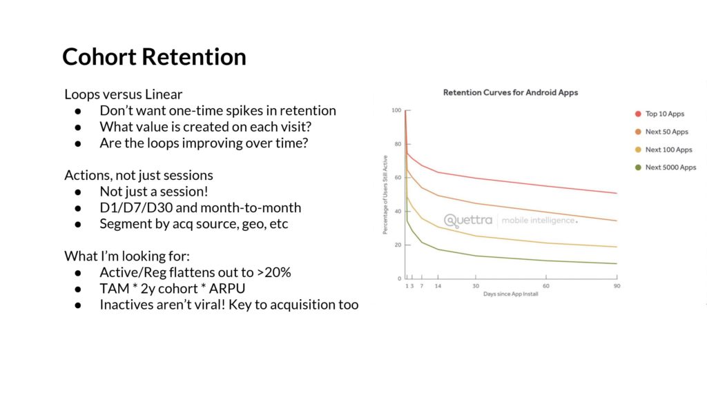
Above: The first, as everyone knows, is to look at everything in cohorts. We want to understand conceptually why the user cohorts are being brought back – is there value being created at each visit that makes the product more sticky over time? Are they building a network? We want to understand the classic D1/D7/D30 metrics – for which there are many comps – and also look at the month to month numbers.
There are a couple key things to watch for: The cohort curves need to flatten. Ideally >20%, so that each signup activates into a sticky, active user over time. If only 5% of users stick, then you’d have to sign up 2B users to get 100M MAUs. Not tenable.
You can project out the total size of the company with this, by combining TAM with the cohort % you have left after a year (D365 or D730) and then the ARPU. This needs to be big enough to have venture scale.
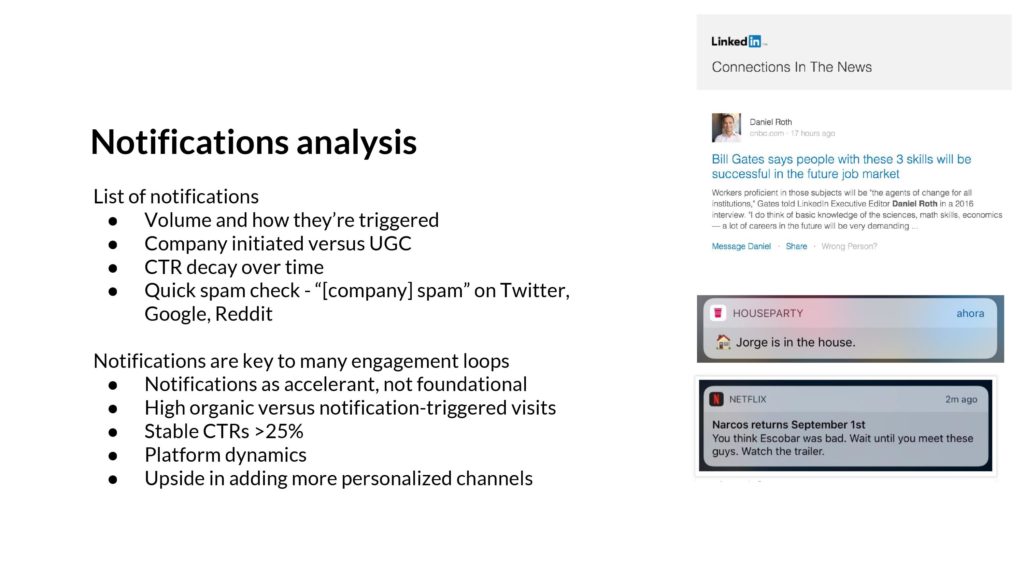
Above: One of the key tools for the engagement loop is the use of notifications – whether that’s email, push notifications, or some other on-platform channel. They are easy to be abused.
To detect artificial engagement that’s being manufactured, not organically created by users, you can look at a breakdown of every notification that a product sends out. And the volume and CTRs over time. You should do a quick spam check on Reddit, Twitter, Google, and other places.
Ultimately, the right attitude towards notifications is that they accelerate engagement that’s already there – you can’t make it out of thin air. Some products naturally generate a lot of notifications, and others don’t. Some are higher CTR than others.
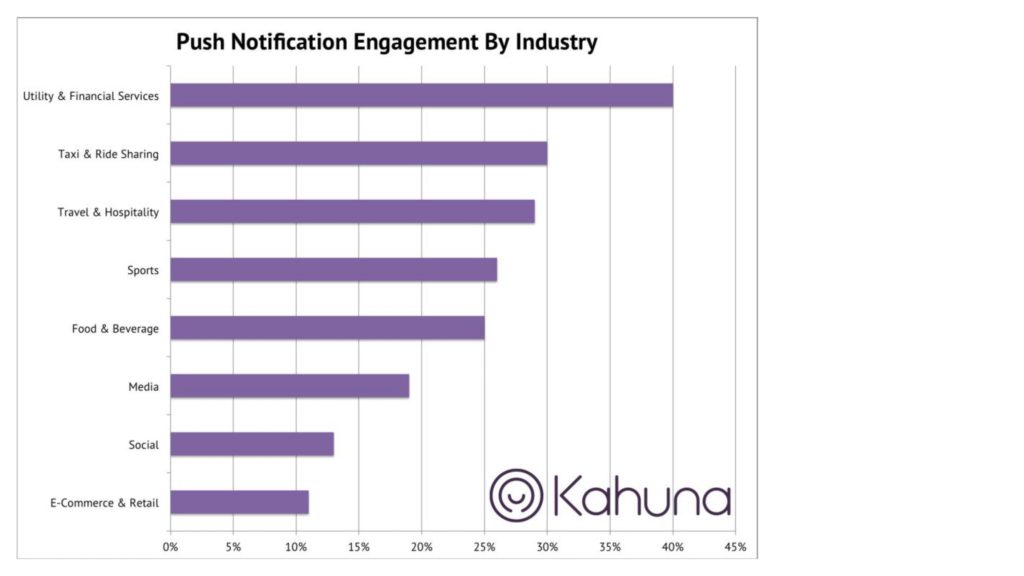
Above: This is one push notification chart I’ve used in the past. Ecommerce companies often use push to advertise sales- no wonder the CTRs are low. But if you are looking at ridesharing, you’ll probably interact with the push because you want to make sure your car is here!
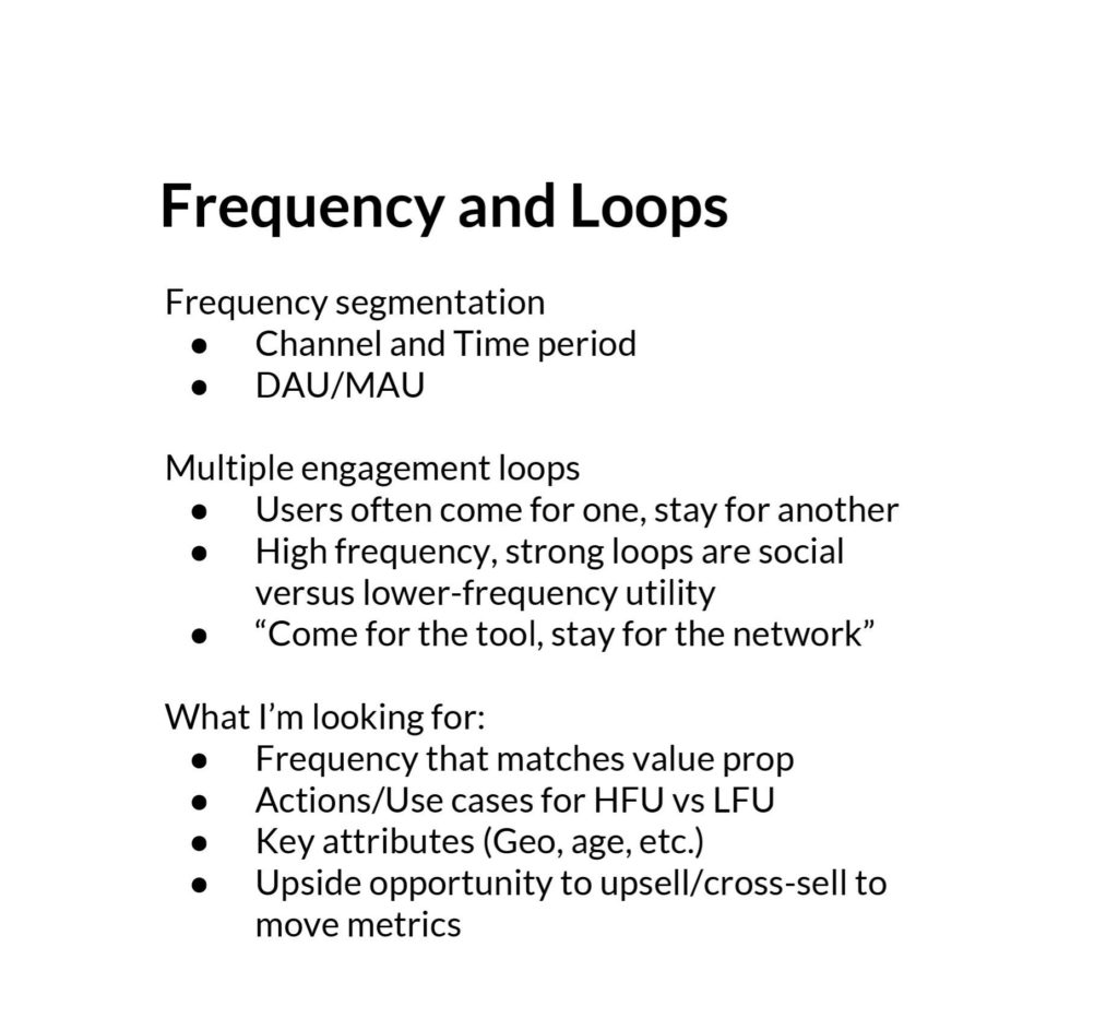
Another set of metrics we want to understand on user engagement is frequency of use. Almost every product I’ve seen has a “ladder of engagement” where you come for one use case, but ultimately become stickier and higher frequency by adding use cases.
For Uber, riders would often do their first trip because of travel use cases, like getting to the airport – this is a 2 trips/year activity. Then they’d layer on “going out” – like dinners on the weekend, which might be 1 trip/week. And eventually a number of other use cases until they got to commuting, which could be 2 trips/day.
What I want to understand with a Frequency diagram is to segment high- and low- frequency segments, and start digging into their usage of the product. If you can upsell new use cases, then there’s a ton of upside.

Now that we have all the tools, we can build the forecast.

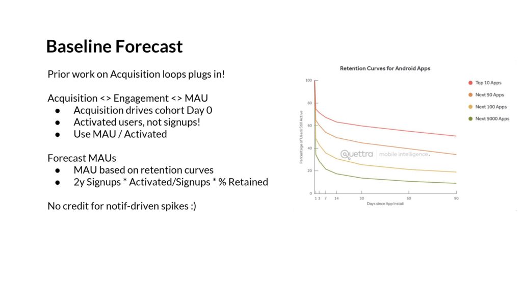
The prior forecast on the acquisition loops can plug into this, because each cohort starts with the number of new users who have been acquired. We can then use the cohort retention curves to build curves that translate to monthly actives or customers.
We can forecast MAUs once we have both the acquisition and engagement curves. Project that out a few quarters, and you can get a fine-grained understanding of where MAUs will be in 2 years.

Engagement metrics are very hard to move compared to Acquisition. As a result, it’s better to assume the curves are what they are. But if you must add a bullish forecast, the right way to go is to focus on new user activation. And up-selling users from one frequency segment into the other. That’s the quantitative way to do it.
And so there we have it!
We have the engagement loop, and the acquisition. We have forecasts for each. We have upside scenarios.
So what can we do with this?
This whole discussion started with the Growth Accounting Framework. If we have a deep understanding of both acquisition and engagement, then we have the inputs.
With the inputs, we can build scenarios that model the outputs.
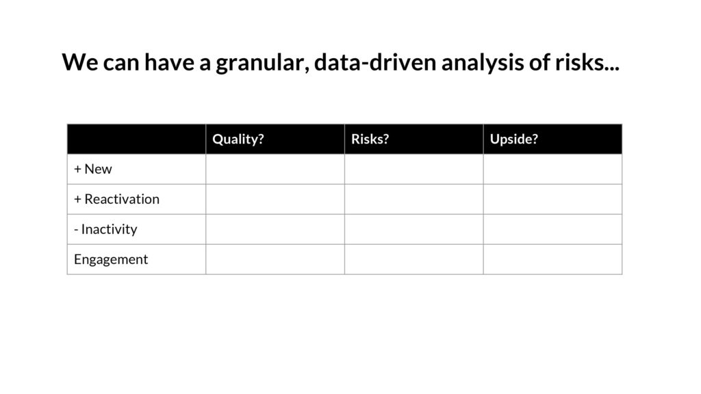
We can get a granular sense of the risks involved. Ultimately this is about a forecast that’s about the quality of acquisition, and the quality of engagement, not a single number in 2 years.
Startups aren’t spreadsheets.
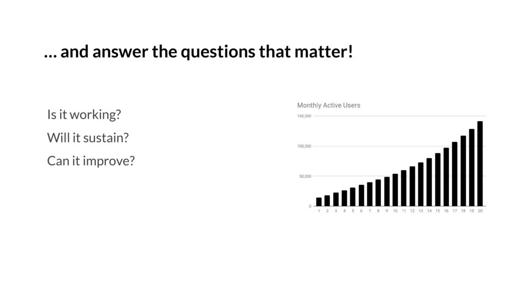
With all of this, we can answer the questions that matter. If a startup walks in the door, and shows a graph, we can have a real discussion of what might happen next.
OK, and that was it. (I chopped off a couple slides off the end since it’s more self-promotion – you got the meat of it!)
The epilogue
One month after I presented this deck, I got the offer to join a16z! So it worked. 10 years in the bay area, dozens of angel investments, 6 months of interviewing, culminating in my new role.
For all of you read this far – thank you! Hope you enjoyed this deck and essay. If you have feedback, shoot me a tweet: @andrewchen.
Thank you
Also, special shoutout to Brian Balfour, Shaun Clowes, Casey Winters, Bubba Murarka, and Aatif Awan who helped me at various points in iterating the content here. Couldn’t have done it without you guys! Appreciate your help on this.
I write a high-quality, weekly newsletter covering what's happening in Silicon Valley, focused on startups, marketing, and mobile.
Views expressed in “content” (including posts, podcasts, videos) linked on this website or posted in social media and other platforms (collectively, “content distribution outlets”) are my own and are not the views of AH Capital Management, L.L.C. (“a16z”) or its respective affiliates. AH Capital Management is an investment adviser registered with the Securities and Exchange Commission. Registration as an investment adviser does not imply any special skill or training. The posts are not directed to any investors or potential investors, and do not constitute an offer to sell -- or a solicitation of an offer to buy -- any securities, and may not be used or relied upon in evaluating the merits of any investment.
The content should not be construed as or relied upon in any manner as investment, legal, tax, or other advice. You should consult your own advisers as to legal, business, tax, and other related matters concerning any investment. Any projections, estimates, forecasts, targets, prospects and/or opinions expressed in these materials are subject to change without notice and may differ or be contrary to opinions expressed by others. Any charts provided here are for informational purposes only, and should not be relied upon when making any investment decision. Certain information contained in here has been obtained from third-party sources. While taken from sources believed to be reliable, I have not independently verified such information and makes no representations about the enduring accuracy of the information or its appropriateness for a given situation. The content speaks only as of the date indicated.
Under no circumstances should any posts or other information provided on this website -- or on associated content distribution outlets -- be construed as an offer soliciting the purchase or sale of any security or interest in any pooled investment vehicle sponsored, discussed, or mentioned by a16z personnel. Nor should it be construed as an offer to provide investment advisory services; an offer to invest in an a16z-managed pooled investment vehicle will be made separately and only by means of the confidential offering documents of the specific pooled investment vehicles -- which should be read in their entirety, and only to those who, among other requirements, meet certain qualifications under federal securities laws. Such investors, defined as accredited investors and qualified purchasers, are generally deemed capable of evaluating the merits and risks of prospective investments and financial matters. There can be no assurances that a16z’s investment objectives will be achieved or investment strategies will be successful. Any investment in a vehicle managed by a16z involves a high degree of risk including the risk that the entire amount invested is lost. Any investments or portfolio companies mentioned, referred to, or described are not representative of all investments in vehicles managed by a16z and there can be no assurance that the investments will be profitable or that other investments made in the future will have similar characteristics or results. A list of investments made by funds managed by a16z is available at https://a16z.com/investments/. Excluded from this list are investments for which the issuer has not provided permission for a16z to disclose publicly as well as unannounced investments in publicly traded digital assets. Past results of Andreessen Horowitz’s investments, pooled investment vehicles, or investment strategies are not necessarily indicative of future results. Please see https://a16z.com/disclosures for additional important information.